Hi Guys!
I'm here to share a layout I created specially for
Fabrika Decoru with the sample pack they sent me. If you have read my previous post, that is the first post I created for them and this second time round, I created something that I haven done in a long time, that is something with the vintage theme!
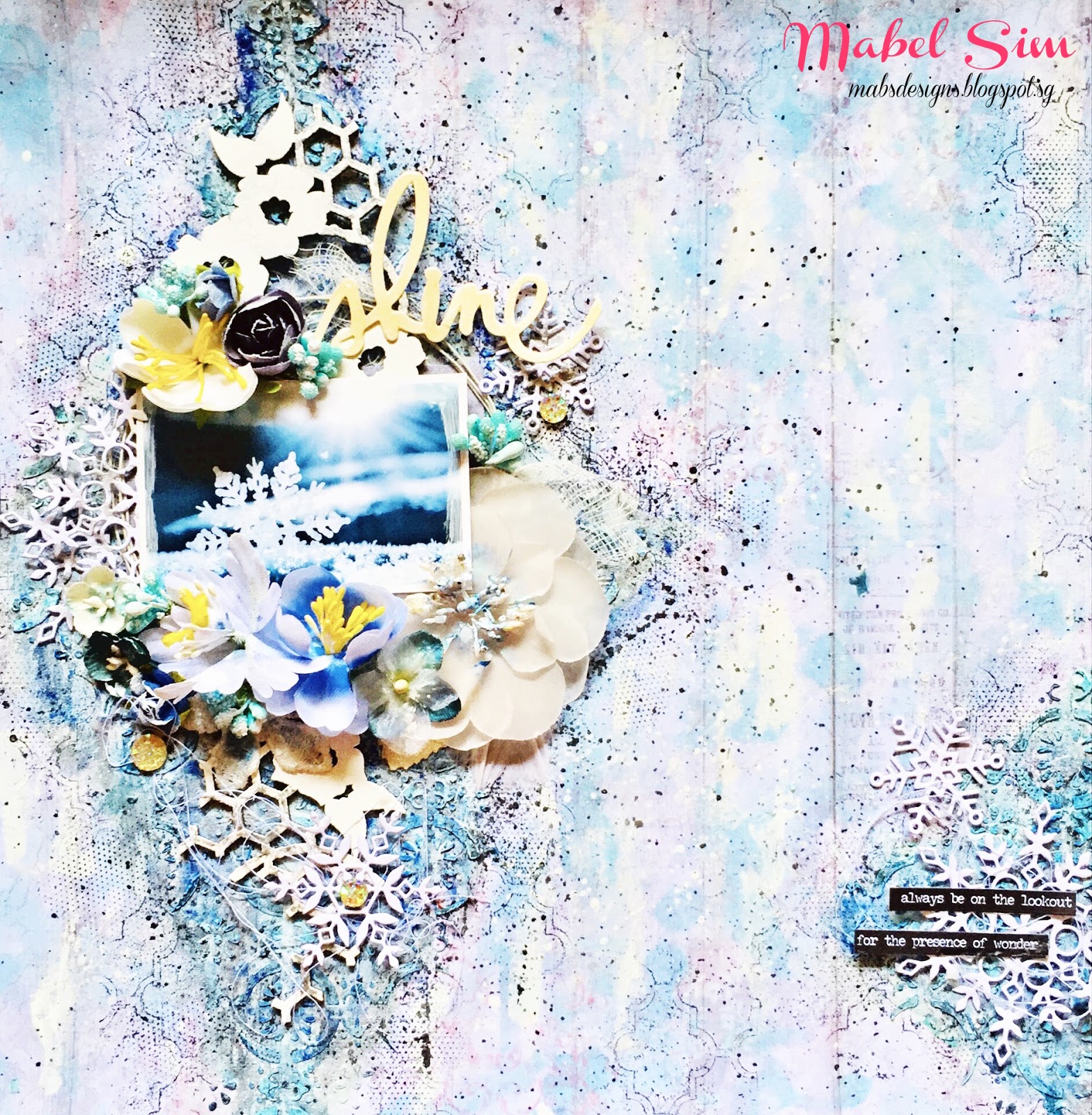
This is the final look of what I have created.
It was especially challenging for me as I'm used to pastel or bright colours. Albeit that, a challenge is always good once in a while right?
My layout was inspired by More than Words challenge, of which their current theme of the month is Imagina and Get Messy. To see their rules in participation, click
HERE!
I first started out with prepping patterned cardstock from Fabrika Decoru's Vintage Romance Collection (FDSP-01003) with a coat of clear gesso. See how pretty the papers are?
My layout flow was inspired by the floral piece. I especially love the hints of blue that seeps through in the midst of the floral. To enhance the flow, I tore off the edges on both sides of the floral paper, the polka dots created some contrast and added interest to the background.
To create some texture, I used Fabrika Decoru's White Texture Paste (FDTPT 150) with their Delicate Lace 1 stencil.
I also used Waves Illusion stencil (FDTR 154) with their White Sand Texture Paste (FDTPS 150) to create some variation to the textures.
I realised this was the same combination I did for the previous layout! I unknowingly grabbed this products, I guessed I really love them! <3
When the pastes are all dried, I started applying colours. For my previous layout, I put the focus onto the sprays that was given to me, this time round, I'm putting the focus on to the acrylic paints.
I'm using Deco Acrylic in Peach (FDAD 33), Wheat (FDAD 38) and Olive (FDAD 14).
What i did was I slightly dilute them with water to make them less intense, with the liquidity, it was easier to maneuver. As you can see, I just randomly brush it on without any rules as to where the colours should go. The only thing that you should keep in mind is that ALWAYS dry each colour before applying another. If the colours mixed together, they will tend to get muddy.
After all that's done, I decided I need darker colours to create some contrast, hence I'm using Fabrika Decoru's Chocolate Truffle Spray Chameleon (FDSH 22) as well as to create some sprinkles with black and white sprays, as well as the 3 diluted Deco Acrylic previously used to colour the background.
Don't worry if this looks all messy and ugly, I promised everything will be better afterwards when my centrepiece goes up!
Now I'm starting to build my centrepiece!
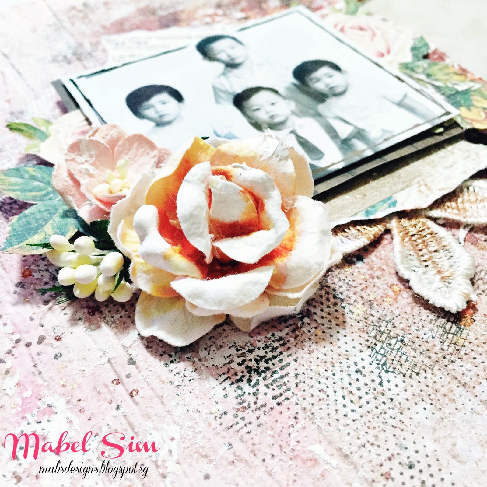
I was very attracted to the lace 'doily' thing that framed Fabrika Decoru's logo. This sheet was actually the coversheet for their Shabby Dreams Collection (FDSP 01012). I was pleasantly surprised that even the coversheet was printed in weighted cardstock! Hence, I decided to fussycut out the doily and add it to my layerings.
There you go! This concoction of paper layerings were made from the Shabby Dreams collection and Vintage Romance collections. Aren't they lovely?
However, when I placed it on top of my background, I decided that my centrepiece looks too 'clean' for the background.
Hence, I distressed the edges of my papers with brown ink and a sponge to give it a 'vintage' look.
Time for embellishments!
I added Prima Marketing's wire trims by coiling them in circles to bring the focus to the photo. I also decided that the green I wanted was buried with all these layering of colours and embellishments. Hence, I painted the wire trim with Deco Acrylic Olive.
I used assorted flowers from Prima Marketing and my personal stash as well as randomly tangled some black sewing threads and used them as my embellishments. The black thread around different areas of the layout helps to ties in the different elements of the layout.
At the bottom of the picture, I also added some diecuts from Fabrika Decoru's Chipboard Stickers Letter of Love (FDV 001) to create some balance to my layout. As you can see, my centrepiece is slightly towards the left of the layout, hence I need some balance on the right.
So here's the final look and some close up shots! :)
All items are adhered with Fabrika Decoru's All Purpose Transparent Glue (FDGU 40).
SUPPLIES USED
FABRIKA DECORU'S PRODUCTS
(in appearance order)
OTHER PRODUCTS
Prima Marketing Flowers
Prima Marketing Clear Gesso
Prima Markeing Wire Trim
Tim Holtz Small Talk Stickers
Tim Holtz Distress Ink Pad - Vintage Photo
Tim Holtz Distressing Tool
Dylusions Ink Spray - Black Marble
Kaiser Mist - White Iridescent Spray Ink
Black Sewing Thread
That's all for this blog post!
I hope you like what I did!
Thank you for having me Fabrika Decoru!